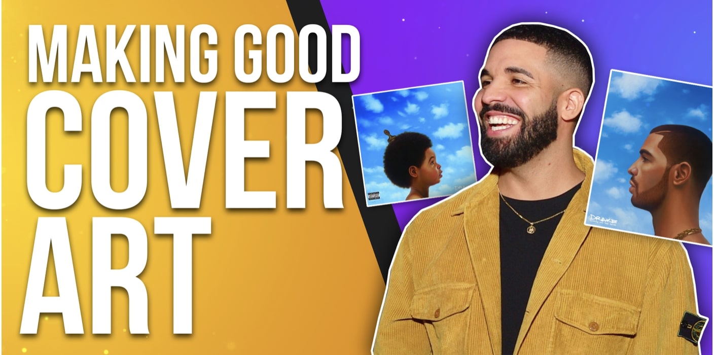
How to make your album cover go viral!
Looking to make your album artwork go viral? When you make it so good, it'll go viral in no time.
I got you covered!
7 key principles for a good cover art:
- Understand the role of cover art
- Keep the album art relevant to the music
- Think about the cover art merch
- Look at examples of good vs. bad cover art
- Make good cover art in only 5 minutes
- Learn the basics of good cover art
- Get amazing cover art on a budget
If you don't read...
Go ahead and watch my guide below.👇
Bonus: How to Make a Rap Album Cover Easily!
Want to get your music on active & relevant playlists that actually get results?
Get your music heard now 👇
We'll make you your cover and send it to you over email within 48-72 hours!
the role of music cover art
Your album/single cover art serves as the gateway to your project.
Your cover art prepares your listener for the full audio experience!
5 best practices for making an album cover:
- Keep the album cover relevant to a musical project
- Consider how the cover art will look as merch
One of your main priorities is getting this aspect done to the highest of standards.
When you execute your cover art to the highest degree, then you’re setting the mood, theme, and vibe of the project.
Most people select a track based on how compatible the title and art are compatible with them.
When your potential listener sees the song on a streaming platform...
They process whether they’re going to resonate with your music simply based on the art.
Get the cover art done right, damn it! It can even make or break a release. Seriously.
#1. Keep the album cover art relevant
When your cover art accompanies the project, you’re creating a mental image in the listener’s mind.
Why does this matter?
This image corresponds to your brand!
The connection strengthens your brand, giving your listener an in-depth reason to check out your other music.
This extra branding can convert them into true fans at the end of it.
Who would say no to growing their fanbase? Pffft. Exactly.
Think of it like this: Shakespeare’s books have covers that reflect the content inside.
If Shakespeare decided to make a book cover that didn’t correlate with the project, then…
Things would get weird fast.
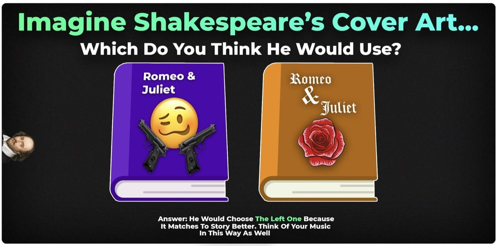
Not only that, his core fans wouldn’t even feel connected to the project and go check out somebody else.
I know, I know. You aren’t an author (songwriters, you don’t count.)
This goes to show how the role of your music album art is significant beyond comparison for your project’s success.
#2. Think of how the cover art will look on merch
Don’t forget this possibility: your project has the potential to blow up and become an instant hit.
Your song exploding is a rare probability however, it does happen!
At that point, your core fans will die to get their hands on any merch surrounding this viral project!
Have you ever seen somebody wear an album cover hoodie? The next artist merch somebody buys could be your album.
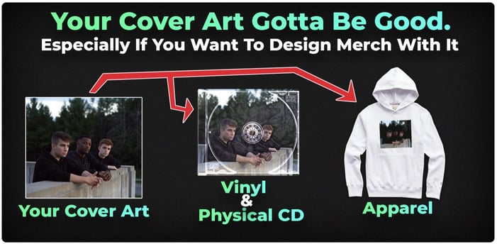
You must carefully ask yourself these questions:
- Is my cover art up to standard for this?
- Does it look good enough to hang on wall posters?
- Can this look good in a vinyl/CD collection?
- Would this cover art/album title look good on a hoodie/tee?
- Am I proud of this artwork?
If you answered no to any of the questions above then it’s time to reconsider the music cover art.
The better the cover art is, the easier it is to sell the product surrounding it.
No matter how hard-core your fans are, they will not buy garbage.
It’s difficult to sell garbage, yet easy to sell good products.
Make your cover art a product people can appreciate and you overcome this issue with ease.
Good vs bad cover art
Before I get into this topic I should put out a disclaimer: good and bad is subjecting (and vague to a degree.)
What I like is potentially different from what you like.
Everyone has their interests so it isn’t correct to throw around terms like good or bad without setting clear definitions first.
That being said, good design has a few solid principles that never fail, since album artworks are a visual thing, we can (almost) all agree on some things.
Here are the principles regarding cover art:
A good music cover art includes:
- Relates to the musical content
- High quality
- Square image
- Conveys emotion
- Fits the brand image
- Good attention to detail
Avoid making a cover art like this:
- Low quality
- Sloppy
- Strange resolution
- Bland
- Forgetful
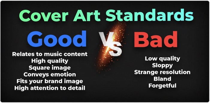
Apply this to your previous cover artist and judge them yourself!
what makes a cover art "good" though?
Exceptional music cover art evokes a strong emotional reaction.
Don’t get this twisted, I’m not telling you to go full emo with your cover art (If that’s your brand though, have at it!)
The common misconception about emotion is that it needs to be either happy or sad.
Emotions are like a box of chocolates, a huge variety.
Here is a list of common emotional responses your cover art can try to evoke:
- Fear
- Joy
-
Sexual passion
-
Loneliness
-
Humor
- Anger
- Surprise
Here are examples of music cover art that accomplish this to high levels:
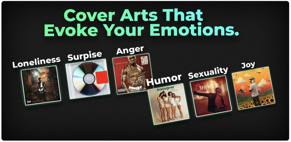
For an extra tip, if you can combine certain emotions then you’re hitting two birds with one stone!
The combination adds versatility, thus increasing your scope of potential listeners.
highlight the project, not The artist
I hope you aren’t making this rookie mistake!
A lot of starting-off music artists seem to get this strange idea that their music cover art is some sort of profile picture.
This could not be further from the case!
It’s essential to have consistency in project cover art.
This lets your fans know what to expect and sets an image for your music brand.
Very few are mirror selfies (almost none!) Rather they’re highly edited pieces of beautiful artwork. There is a good reason behind this.
The role of the cover art is to express the art! You must have it designed to merge with the music’s aesthetic.
A couple of great examples of this concept are found in the cover art of ASAP Rocky.
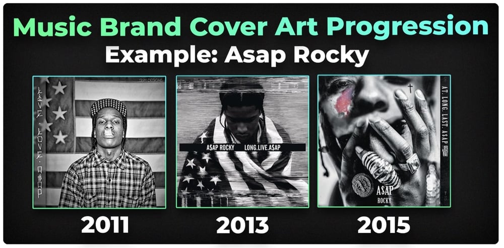
When you look at their projects, the cover art molds the experience.
Even with ASAP Rocky having his face on the cover art, it works to express the projects at hand.
Keep the core element there, focus on the brand experience, and stay consistent! These are the main aspects covering art success.
Keep this in mind as you consider the purpose of your cover art.
Cover Art Matters: Designing Good Artwork
Cover Art Matters is a site where you can get nice cover arts!
The thing is, Cover Art Matters offers templates for around $60-$70.
If you want the same quality artwork but 100% Free Cover Arts then Boost Collective is for you!
I do recommend you at least check out Cover Art Matters though. :)
only a High Definition album covers
Having a high-resolution cover art is a must.
This is because your cover art image can be used for multi-purposes as I’ve mentioned HERE in the article.
Keep it high-definition!
What's the point of making a jaw-dropping good project only to crap on it with it a bad cover?
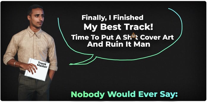
Most distribution software has the optimal resolution of 3000 x 3000 pixels.
The reason for such high standards for picture quality is that the cover art has different appearances based on the display.
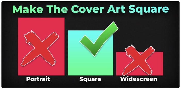
Please for the love of God, do not submit a landscape or portrait photo.
It will be auto-cropped and most often not to your liking!
You must strive to keep it square.
Cover art content
I always say to make sure that the cover art is very artistic,
That said, there are times when you do not want to be too explicit, especially for sex and violence.
Avoid adding these to your cover art if you can:
- Amount of nudity
- Guns
- Gore and excessive violence
Even Kanye West’s (arguably best) album My Beautiful Dark Twisted Fantasy was initially banned due to the grotesque nature of the cover art.
If even Kanye West gets frack for this. What would happen to you?
Not only that but making it highly explicit can turn off a majority of listeners. It’s something to consider in great detail.
how to get a cover art (for cheap!)
There is only one way to have good cover art. What is it?
Designing a good cover art.
Music cover art does not magically fall from the sky, it takes a lot of specific skill to create it.
Now the question is - will you create it or somebody else?
#1. Doing It Yourself (DIY)
The primary benefit of designing it yourself is that you have full creative control!
There are no creative limitations to what you can accomplish here.
The one negative is that…. It’s not an easy learning curve.
You have to learn so many things such as Photoshop, principles of design, typography, etc.
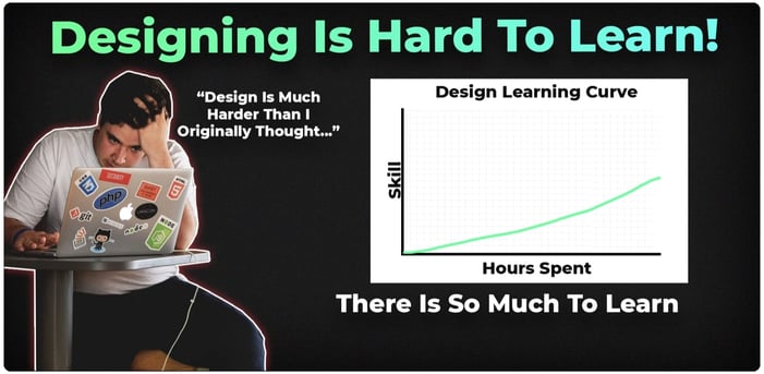
It becomes a whole project to learn this, taking up so much of your time mid-releases.
Sure, you can slowly learn it but time is too valuable to waste. Fortunately, there are two other options.
#2. Hiring A Designer
This is fun! By hiring a designer you can be sure to save you time!
The designer already has the skills required to make your vision a reality and has professional experience.
The only issue here isn’t the time cost… It's the money cost.
Designers are generally working for themselves so they have to charge to get a return for their labor and time.
These expenses go into your total cost!
With a freelance designer, you may have to pay from $40-$200 for a design that’s worth a damn.
That’s money that can otherwise go to bigger promotions to build that dream fanbase!
Fortunately, option 3 is the best of both worlds.
#3 - The Best Option (Honestly)
This option takes the benefits of DIY and hiring a designer:
- Fast
- No stress and learning curve
- Creative control
And the best part? It’s not expensive, meaning you’re saving a lot of bucks in your pockets. Your wallets will thank me later.
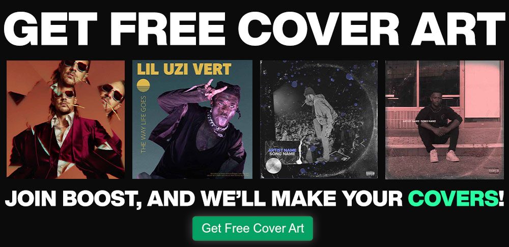
Independent artists aren't willing to sign away to a label but you can still use the help from a team of professionals.
Do you think Drake and Justin Beiber don't have a team to help them with things like this?
We at Boost Collective are here to personally help you design the best cover art for free by using our platform!
I hope you now know how to make your album cover go viral!
Read Next: 10 Best Cartoon Rapper Album Cover Ideas!
Get your music on playlists now.
It’s time you get your exposure and listeners up - playlisting by Boost Collective has been trusted by 50,000+ artists worldwide.
It’s easy: Search your song, get on playlists, and track your campaign.
What’re you waiting for? Tap in - and get added to playlists in 24 hours.
Join Boost Collective for free here.
