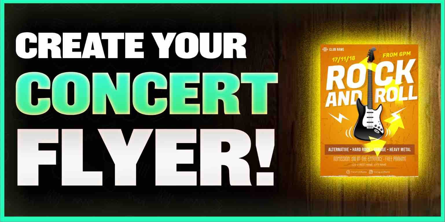
Create a concert flyer in 5 minutes!
Need a rock concert graphic for your next show?
It’s very easy to do! The rock genre is very particular with its styling thank goodness.
To create your rock show flyer, you only need to hit a couple of nails on the head.
7 essentials of a good rock band flyer:
- Text
- Faces
- Color
- Location
- Date & Time
- Ticket info
- QR Code
Let’s break down these 7 rock show flyer essentials some more.
Want to get your music on active & relevant playlists that actually get results?
Get your music heard now 👇
#1. Text
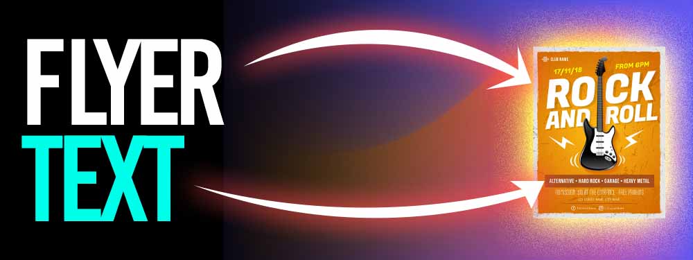
People need to read your concert flyer… duh.
This is why the rock band flyer’s text is so key. It can determine the level of effectiveness of your concert flyer.
Add the important information (location, ticketing, dates, who’s playing) at the top text in the flyer.
Then, once you’re done, you can select a nice font styling.
Here are some text fonts that match rock music well:
- Gothic
- Iron Maiden font
- Metallica font
So long as it’s zany but readable then you’re good. That’s how you put together your rock show flyer text.
You should customize the graphic design of your concert flyer so that it's bright!
The background should be a bright color, with large text in a professional style.
#2. Faces
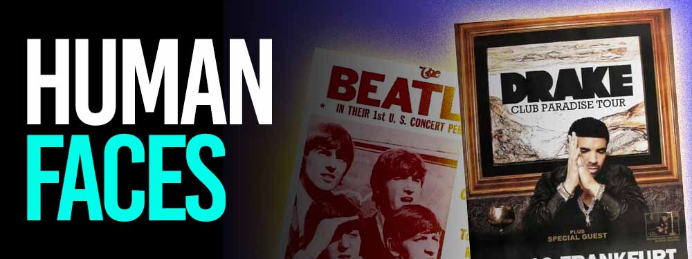
You’ll need faces in all of your rock show flyers.
This can range a lot though, it can either be cartoon but I find the rock show flyers with real high-resolution photographs work best.
You don’t even need a crazy 4K camera to take the portraits for you… Your iPhone with good lighting is more than enough to get the job done.
A full-body shot of you rocking the guitar is a wonderful way to showcase your musical skill in the rock show flyer.
#3. Color
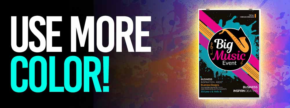
The color aspect can be liberal.
You just gotta ensure that you important information on the rock cover flyer is showing.
This means that you can’t have rainbow technicolor gradients on both the text and background.
If your rock band has specific colors, then using them is a great idea.
You can use primary and secondary colors is a great way to balance the color scheme of the concert advertising flyer while also having essentials pop out at you.
#4. Location
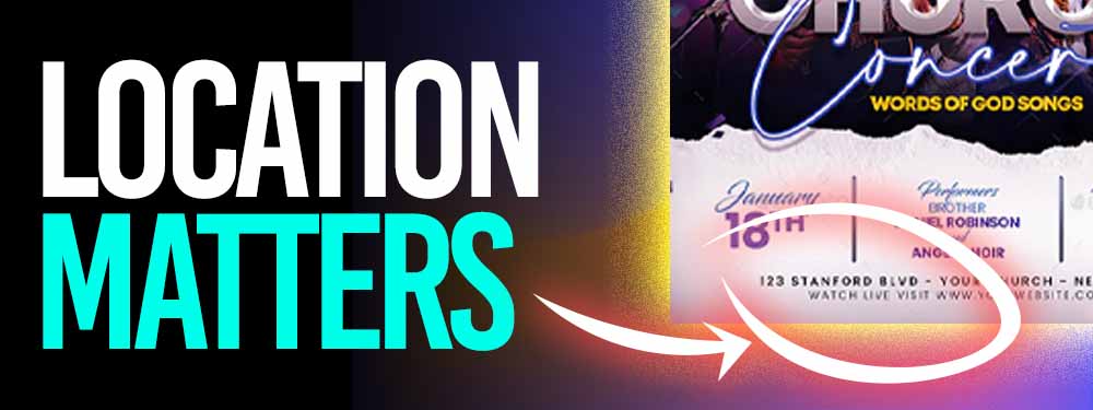
This is very basic.
Unless the consumer knows exactly where your concert is taking place, there’s no way to sell any show tickets.
Say the concert loud and proud in the concert flyer.
Ideally, you want to post these rock show advertisements somewhere in proximity to the actual venue.
#5. Date & Time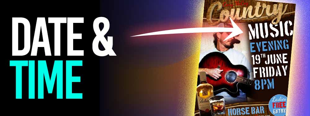
Obviously, you’re going to need more than just that for your concert flyer.
You’ll need the dates and times.
This will let the passerby know whether or not they can make your kick-ass rock concert.
Otherwise, they can’t take time off work or rearrange their schedule to fit you in.
This aspect must be in your rock concert flyer for maximum effectiveness.
If timing is just "in the air" then you’re pretty much ensuring that nobody takes your show advertisement flyer seriously.
#6. Ticket Info
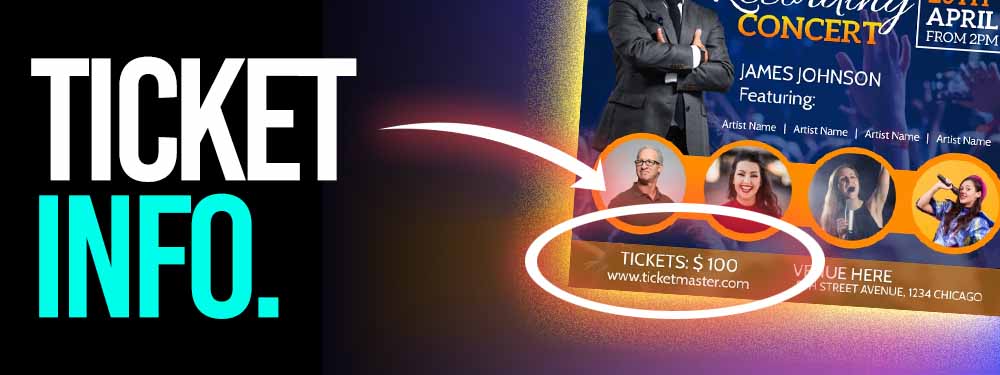
Now when I say ticket info, I’m referring to a few things here.
This could mean the contact, website, or way to purchase tickets.
Unless you can sell ticks, you can kiss your concert flyers' effectiveness goodbye.
#7. QR Code
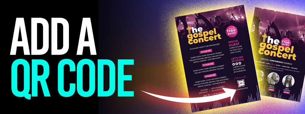
This is the final but equally important step to getting your rock show flyer to be a success.
People are lazy so QR codes make it so easy for them to check out your website, Ticketmaster, etc.
By doing this, you’re setting yourself up for success!
Should you make your concert posters on photoshop?
You don't have to be a next-level graphic designer to make concert posters.
(Same thing where you make your free rap album art!)
That said - a good concert poster that brings your band your live audience performances may take some resources and ideas to create.
To get your band style presented on your concert poster you should use Photoshop.
Concert posters made on Photoshop look the best and have the most detail!
I say though, reserve Photoshop concert posters for a substantial performance.
If the concert only has a few people and you are not making that much money, it's better to use free graphic design tools that won't cost you a pretty penny.
Not to mention using the free graphic design tools will make it much easier to create a concert poster.
Photoshop does not have great concert poster templates...
This is why I urge your band to use a free graphic designer template tool such as Canva!
free concert poster templates using Canva
To put together the images for your concert poster, you should use a template from Canva.
Canvas is a graphic design template website that is free to use.
Just browse one of the hundreds of free flyer templates available!
Every band or music artist with a low budget should use the concert poster templates available in Canva.
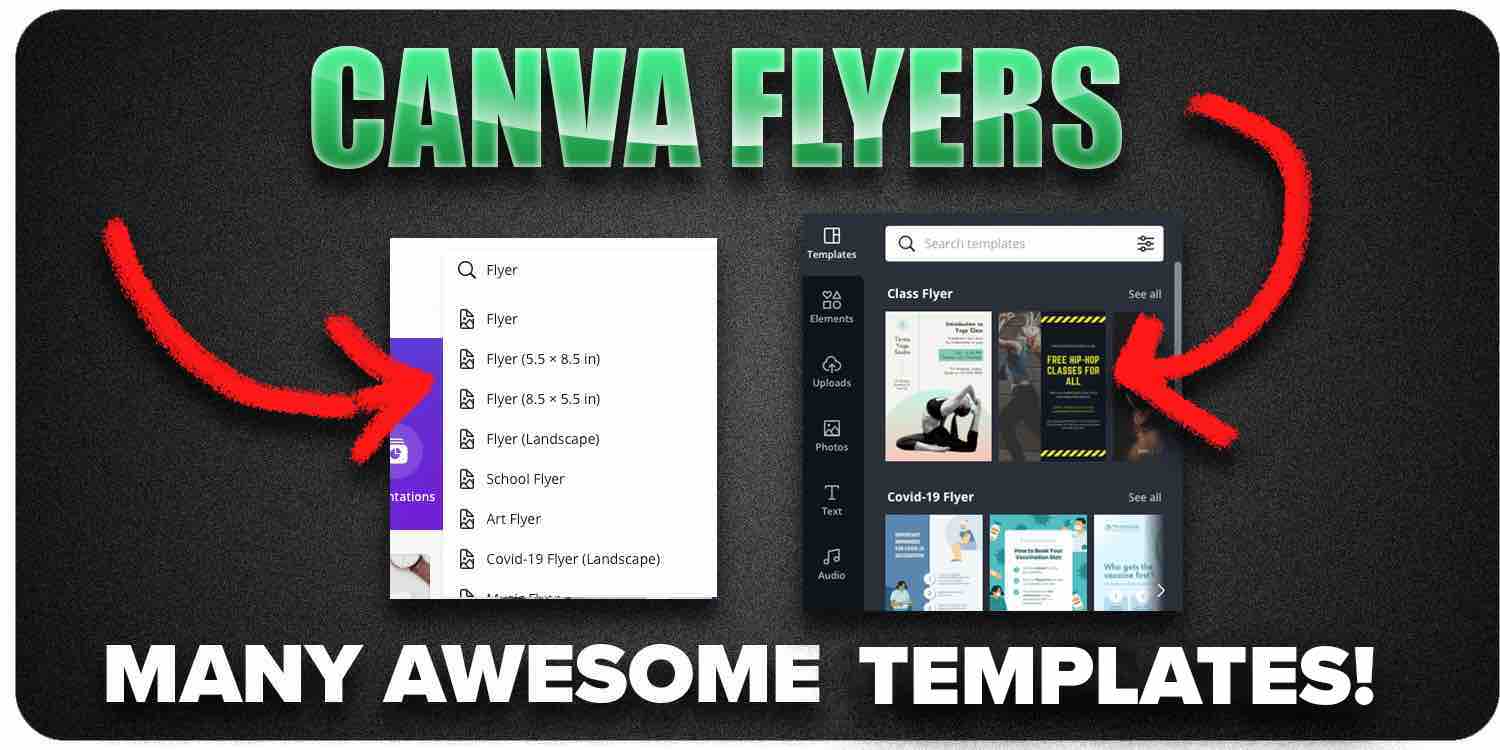
Once you select the free templates you can rock your concert poster - Canva allows you to create the image flyers based on whichever design you pick.
You can upload your photos to make a nice image for your concert poster.
You don't need a fancy editor to remove the background for the concert image.
There is a free background remover editor tool called remove.bg
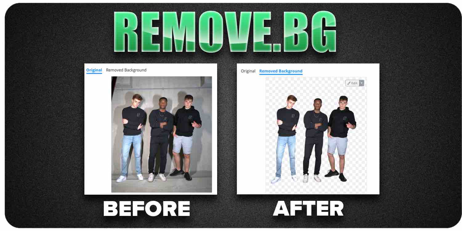
With these resources you can customize the background for your flyer images.
Not to mention, using Canva you can save your concert poster online.
I was able to make a social media concert poster within minutes!
There's no fear of your band concert poster being lost in any way - Canva will auto-save your concert poster design.
You can even share the document and collaborate with other bandmates.
Band Flyer Size

You want to make your band flyers in 8 inches by 11 inches.
If you noticed carefully… that band flyer size is the typical sheet of paper dimensions.
This means that the height of your band flyer is 8 inches and 11 inches in length.
While there are opportunities to change the scaling, it won’t print as easily if you select a different type of image scaling.
You can also make your band flyer size 11 x 8 which is the horizontal orientation of the page.
This might not help you though, since most flyers are vertical, then the human mind might overlook the rock band flyer when you hang it on telephone poles and such.
Optimize your concert posters for social media
Not only does your concert poster look good for a flyer, but it also needs to fit online social media as well.
Assuming you have somewhat of an audience you can reach more people with less work online via social media.
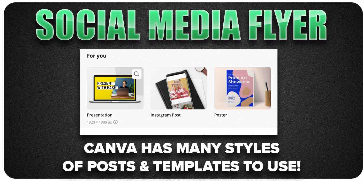
Posting a flyer on a telephone wire is limited to only the foot traffic there.
If you really want to rock your next event - social media is the #1 place to promote!
Use the Canva template to create posters that promote your event on stories.
You can get your friends to promote your event online with the optimized flyer image!
3 awesome poster templates musicians should use:
- Story poster templates
- Square feed poster template
- Video poster templates
Proper optimization can make your flyer and album cover go viral!)
The more poster templates you use, the higher the chance your band can sell more music tickets for your event.
You must promote your flyers over and over to have maximum effect!
Get your music on playlists now.
It’s time you get your exposure and listeners up - playlisting by Boost Collective has been trusted by 50,000+ artists worldwide.
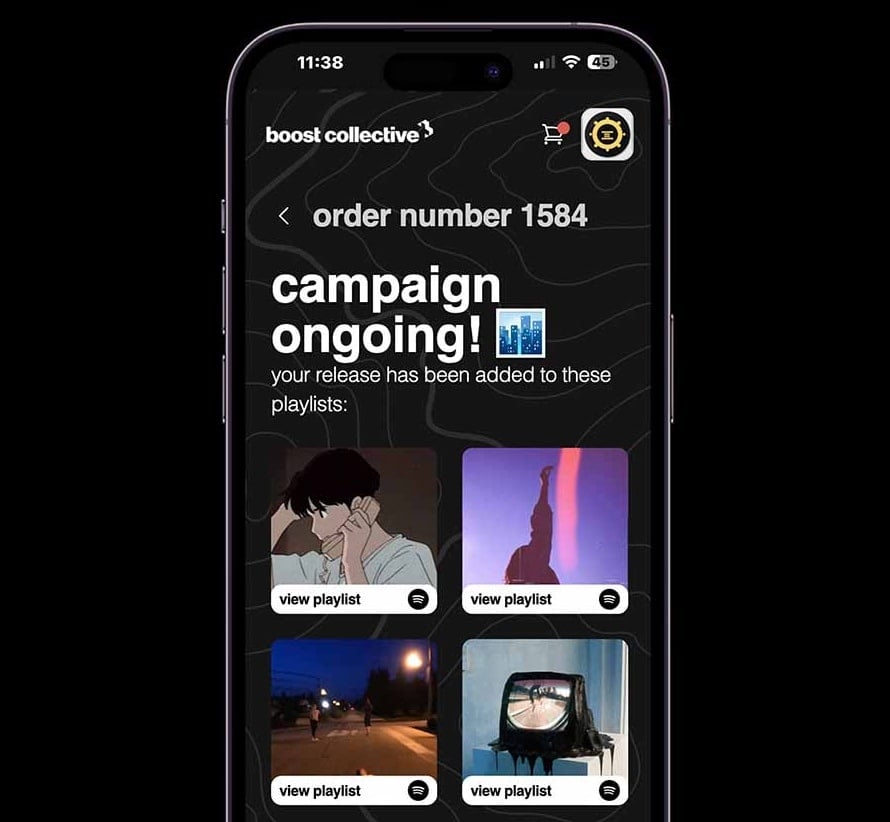
It’s easy: Search your song, get on playlists, and track your campaign.
What’re you waiting for? Tap in - and get added to playlists in 24 hours.
Join Boost Collective for free here.
